Thryft
A user-focused platform that simplifies secondhand furniture transactions.
Role
Product Designer
Tools
Figma, Adobe CC
Timeline
August - December 2024
Skills
UI/UX, Branding
Whether you’re making a home in New York City, staying for a short while, or preparing to move on, buying or selling furniture can feel like an overwhelming endeavor.
Our team came to realize that many others shared similar struggles – relocating furniture is draining, transporting it is cumbersome, and avoiding scams, both online and in person, demands considerable vigilance.
THE PROBLEM
The secondhand furniture process is frustrating. People waste time, effort, and money navigating unreliable communication, transportation challenges, and the risk of scams.
Solution Preview
With Thryft, navigating the secondhand furniture market is effortless
.
Discover unique pieces, communicate securely, and manage transactions with ease—all through a trusted, user-friendly platform designed to make buying and selling furniture seamless and safe.
Designing Thryft: Creating a Seamless and Secure Furniture Resale Experience
Thryft is on a mission to make secondhand furniture shopping secure, seamless, and enjoyable, transforming a fragmented experiences into a trusted digital marketplace. The platform addresses common barriers like unreliable communication and limited security.
The project involved extensive user research to uncover the specific needs and pain points of both buyers and sellers in the secondhand market. Through observations, interviews, and usability testing, we refined Thryft’s flow and functionality to create an intuitive, frictionless experience. My role included developing research, wireframes, prototypes, and visual designs that make Thryft feel welcoming and trustworthy, encouraging a thriving community of furniture enthusiasts. The end result is a marketplace where style meets reliability, supporting users in finding unique items they’ll love for years to come.
User Research
Pain Points
01
Negotiations
Pricing in the secondhand furniture market is often imbalanced.
Sellers frequently feel compelled to reduce prices to secure a deal, while buyers leverage the urgency of sellers to negotiate for the lowest possible price, creating a challenging dynamic for both sides.
Privacy and security are major challenges in the secondhand furniture market.
Sellers often rely on public locations for pickups to minimize risks, while buyers must remain vigilant to avoid falling victim to scams, creating an ongoing sense of unease for both parties.
03
Flexibility
Payment flexibility is crucial in the secondhand furniture market.
People favor different methods like cash or Venmo and approach negotiations with varying styles, making it challenging to find a seamless and agreeable transaction process.
04
Logistics
Delivery and pickup play a pivotal role in secondhand furniture transactions.
Coordinating logistics can be complex, with users weighing factors like transportation costs, scheduling challenges, and convenience when deciding whether to proceed with a purchase or sale.
HOW MIGHT WE
How might we make buying and selling secondhand furniture more secure, seamless, and stress-free for users?
Version 01 – Messaging
We first explored the idea of enhancing communication. During user research, one of the biggest pain points we uncovered was that both buyers and sellers frequently faced issues like ghosting or missed messages. To address this, we introduced a built-in messaging system designed to streamline connections, facilitate questions, and coordinate transactions directly on the platform.
However, challenges quickly emerged: improving communication alone wasn’t enough. Users still harbored concerns about scams and miscommunication, and the system failed to address the deeper need for trust and security.
In addition, did this truly set us apart from existing tools like Facebook Messenger or Craigslist?
Version 02 – Onboarding
In an effort to create something new yet familiar, we shifted our focus to developing a seller onboarding tool. This aimed to address a common pain point: the logistical friction between buyers and sellers, such as delivery options, pickup arrangements, and payment methods. The tool allowed sellers to clearly outline key details like preferred payment methods, delivery capabilities, or pickup-only options.
While this tool provided valuable benefits for sellers, it lacked a solution to truly secure transactions between two strangers.

We had plenty of ideas, but they weren’t coming together effectively.
So, we took a step back and focused on the core issues: users felt frustrated, overwhelmed, and uneasy.
How do we address all three now?
We went back to the drawing board and even conducted a gallery walk to receive feedback and outside perspectives.
Version 03 – A Home for All Things
Ultimately, we wanted Thryft to feel like a trusted home for secondhand furniture transactions.
Every feature was designed with this in mind, from flexible listing tools to our MVP, Thryft SecurePay.
The Home Page
Clear and concise – we wanted buyers to quickly grasp a snapshot of the furniture available.
Seller Onboarding
Simple and intuitive – we wanted sellers to effortlessly list furniture and showcase key details.
Sellers can choose their preferred payment methods, including Thryft SecurePay, cash, Venmo, or Zelle, or a combination of these options. Additionally, sellers have the flexibility to automatically accept buyers willing to pay the firm price or manually review and approve offers, giving them greater control over their transactions.
SecurePay
Secure and reliable – Thryft SecurePay became our MVP, ensuring transactions are smooth and trustworthy by holding funds in escrow until both parties are satisfied.
Thryft SecurePay ensures a safe and seamless payment experience by using an escrow system. When a buyer places an offer and it’s approved, the payment is securely held by Thryft until the transaction is complete. The buyer and seller then coordinate for pickup or delivery, and once the item is exchanged, the buyer provides a QR code or unique transaction code to the seller to confirm the handoff. This releases the funds to the seller. In the event of a dispute, Thryft holds the payment and steps in to mediate, ensuring fairness for both parties.
Design System
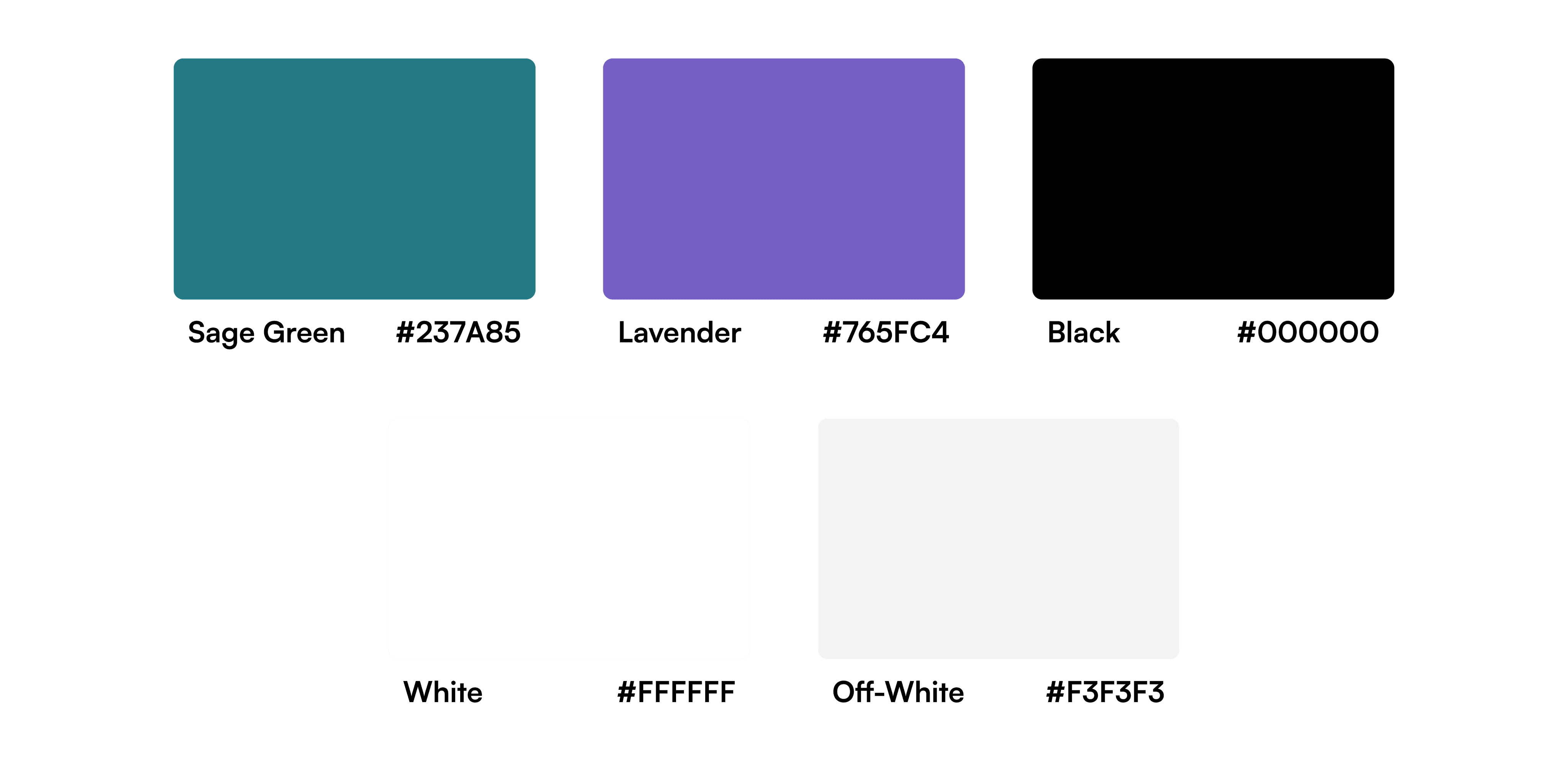
For Thryft, the branding was crafted to feel approachable and trustworthy, ensuring that users of all backgrounds—whether tech-savvy or not—could navigate the platform with confidence. The goal was to create a seamless and inviting experience, making the process of buying and selling secondhand furniture as stress-free as possible.
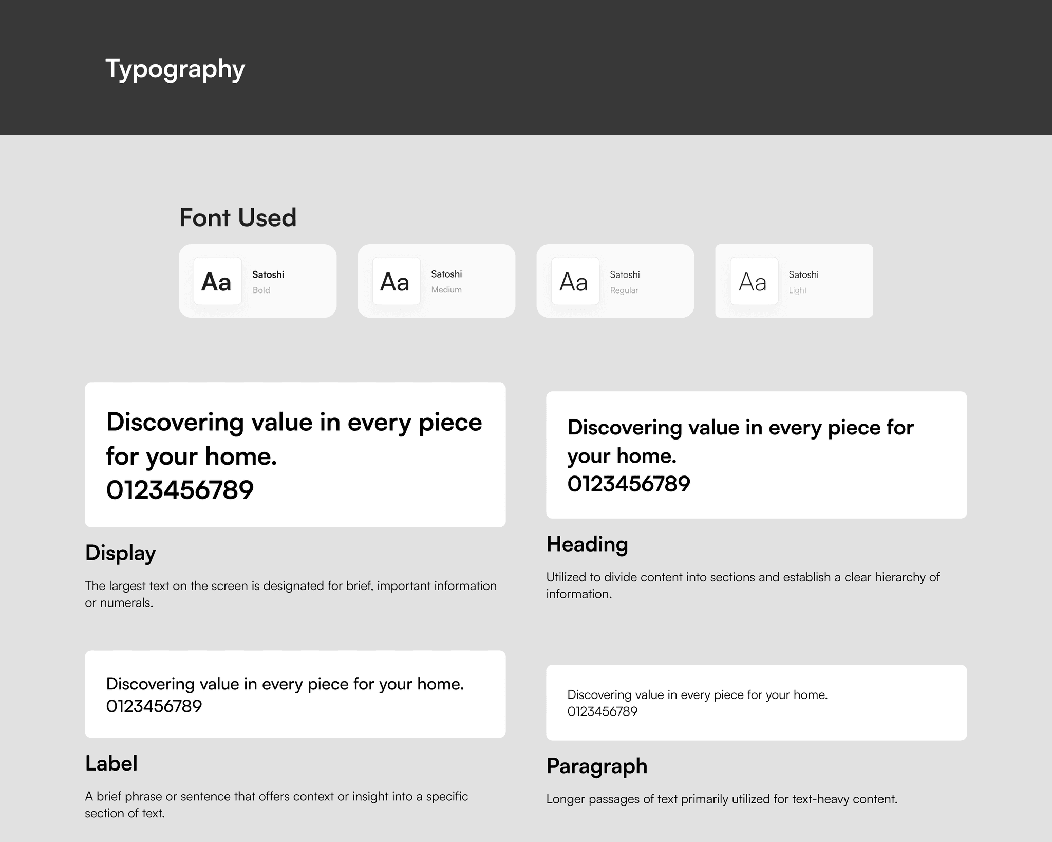
A Minimalistic Design System
The focus was on building a scalable and adaptable design system that aligned seamlessly with the platform’s needs. By reducing unnecessary variations and states, the system prioritized clarity and accessibility, ensuring a consistent and intuitive user experience across Thryft.
Project Takeaways
Purpose Meets Impact
I learned that every design decision carried both purpose and impact.
The purpose lay in the
reasoning –– how the choice aligned with solving user pain points and driving the platform’s vision forward.
The impact was the practical execution –– ensuring each design was feasible and seamlessly integrated into development workflows.
Together, these elements formed the foundation of Thryft, creating a product that balanced user needs with technical precision.
Designing for Cohesion
Design was more than creating visuals — it was about building an interconnected system where every detail worked in harmony.
From product functionality and user interfaces to branding and communication, every choice shaped the overall experience. Adjusting one element, like a button’s color or a font style, had a ripple effect on how users perceived and interacted with the platform.
This holistic approach reinforced the importance of cohesion.
The challenge was significant, but seeing these elements come together to create a seamless and intuitive platform made it incredibly rewarding.


